There’s something magical about turning to a fresh page in May, especially when you approach aesthetic journaling as a gentle ritual rather than another productivity task. Instead of overwhelming yourself with endless goals, the Focus Page method transforms your monthly intentions into a beautiful, manageable framework that honors both function and beauty.
Why Goals Overwhelm But Focus Pages Flourish
Let’s be honest—most of us have abandoned ambitious goal lists by February. The reason? Goals feel like demands, while focuses feel like invitations. When you create a Focus Page for aesthetic journaling, you’re not setting yourself up for failure; you’re creating space for intention to bloom naturally.
Traditional goal-setting asks “What do I need to accomplish?” Focus Pages ask “Where do I want to direct my gentle attention?” It’s the difference between a rigid schedule and a soft morning ritual—both have their place, but only one feels sustainable when life gets complicated.
The Three-Area Framework: Simplicity in Beautiful Practice
The magic of the Focus Page lies in its elegant simplicity. Instead of juggling ten different areas of improvement, you choose just three focal points for your month:
Soft Habit: One nurturing routine to weave into your days (like morning pages or evening gratitude)
Joy Priority: Something that brings pure delight to your everyday aesthetic
This framework ensures your monthly intentions feel curated rather than chaotic. Each area gets meaningful attention without the pressure of perfection that often derails our best intentions.
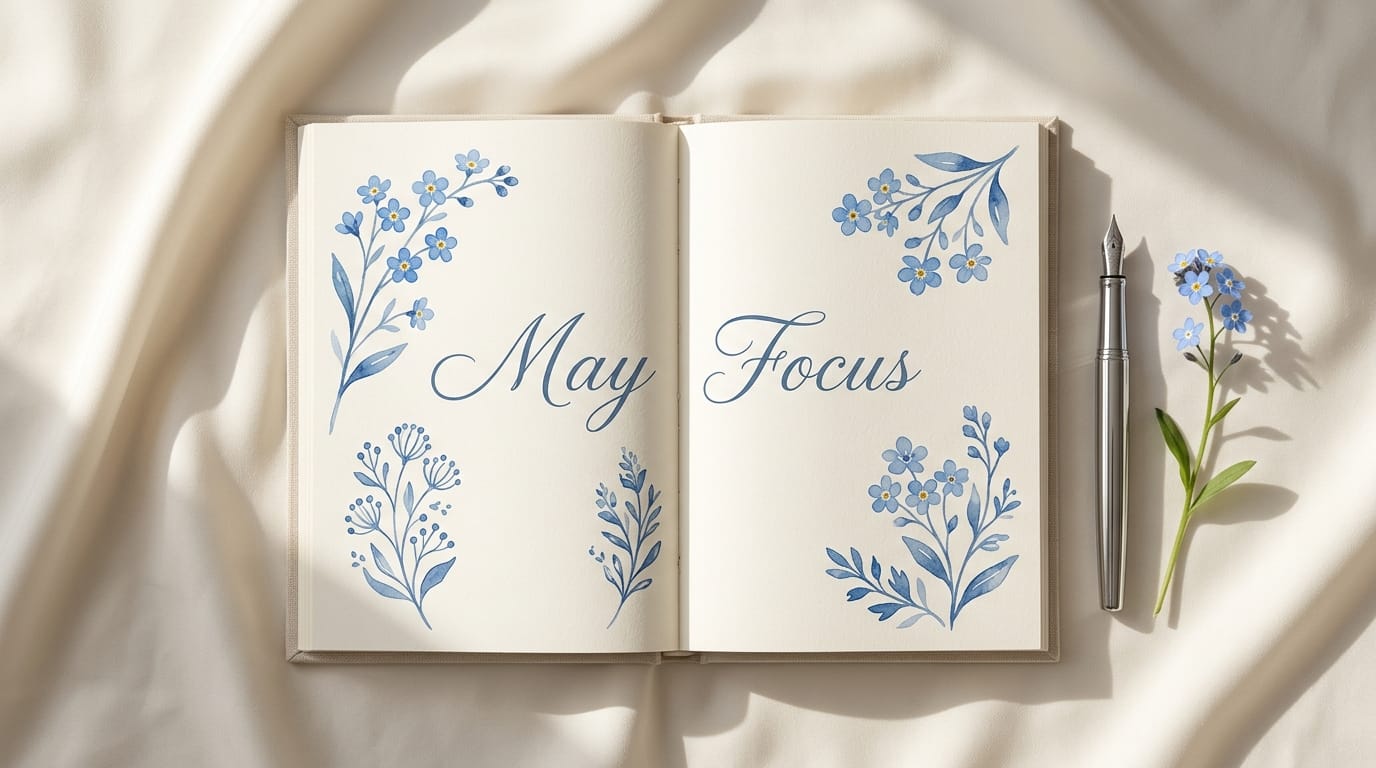
Blue Floral Layout Ideas: Creating Your May Aesthetic
May’s trending “Night Blue” and “Cobalt” floral themes create the perfect backdrop for your Focus Page. Here’s how to incorporate this calming aesthetic into your aesthetic journaling practice:
Color Palette Foundations
Start with a base of cream or soft white pages, then layer in varying shades of blue. Use dusty navy for headers, cobalt for accent lines, and the softest powder blue for background elements. This creates visual hierarchy while maintaining that coveted quiet luxury feel.
Floral Element Integration
Rather than drawing complex botanicals (unless that brings you joy), consider these gentle approaches:
Delicate washi tape in blue floral patterns to frame your focus areas
Small pressed flowers in blues and whites tucked into page corners
Watercolor pencil dots in varying blue tones to create subtle floral clusters
Simple line drawings of stems or single petals as section dividers
Layout Structure That Flows
Design your Focus Page like a beautiful room—with breathing space and intentional placement. Create three distinct but connected sections for your focus areas, using soft blue borders to define each space without harsh lines. Leave plenty of white space; it’s not empty, it’s restful.
Making Your Focus Page a Living Document
Your May Focus Page shouldn’t sit pretty and unused. Throughout the month, return to add gentle check-ins, small celebrations, or course corrections. Use the same blue floral elements to maintain visual consistency as your page evolves with your journey.
Consider dedicating one evening per week to what I call “Focus Page Fridays”—a soft ritual where you brew tea, light a candle, and reflect on how your three areas are unfolding. This isn’t about measuring productivity; it’s about honoring your intentions and adjusting with grace.
The beauty of aesthetic journaling through Focus Pages lies not in perfect execution, but in creating a practice that feels as lovely as it looks. When your monthly intentions are held within a framework of beauty and simplicity, they transform from tasks to be completed into experiences to be savored.
Editor’s picks
Best Journaling Essentials in 2026: Complete Buying Guide
Journaling is more than a habit; it is a quiet ritual of returning to oneself and honoring your inner narrative. This guide curates the most intentional tools to transform your writing practice into a sanctuary of soft elegance and visual harmony.
#1Top pick
Linen-Bound Heirloom Journals
These journals serve as a tactile sanctuary for your thoughts, featuring a woven fabric exterior that feels organic and grounded. The heavy-weight, acid-free pages are designed to hold ink beautifully, ensuring your reflections are preserved with grace.
★★★★★4.8/ 5$25 – $45
Key features
Premium linen fabric cover
120gsm bleed-resistant paper
Lay-flat binding for effortless writing
Dual silk ribbon markers
Expandable inner storage pocket
Pros
Timeless, understated aesthetic
Provides a sensory, tactile experience
Durable construction for long-term keeping
Cons
Fabric cover can attract light dust
Heavier than standard notebooks
What buyers say
“Users frequently mention the ‘soulful’ feel of the linen and the satisfaction of writing on paper that feels substantial and expensive.”
Why it stands out: This belongs in your space if you view your journals as future heirlooms that should look as beautiful on a shelf as they do in your hands.
A pen should be a natural extension of your hand, offering a weighted presence that encourages a slower, more intentional pace of writing. These metallic instruments develop a unique patina over time, reflecting the history of your personal use.
★★★★★4.7/ 5$40 – $90
Key features
Solid brass or stainless steel body
Refillable ink converter system
Balanced weight for hand comfort
Fine or extra-fine precision nibs
Screw-on cap for secure closure
Pros
Lasts a lifetime with proper care
Develops a beautiful, personal character
Exceptional ink flow and consistency
Cons
Requires occasional polishing to maintain shine
Higher initial investment than disposables
What buyers say
“Reviewers adore the ‘quiet luxury’ of the weight and how the pen transforms the act of writing into a special occasion.”
Why it stands out: This is part of your lifestyle if you appreciate objects that grow more beautiful with age and use.
Designed for the subtle adornment of your pages, these tapes offer a soft palette of earthy tones and delicate patterns. They allow you to layer textures and fix mementos into your journal without overwhelming the visual calm of the page.
★★★★★4.6/ 5$12 – $22
Key features
Matte, non-reflective finish
Repositionable adhesive backing
Semi-transparent vellum-like quality
Tears easily by hand
Curated color stories (sage, sand, rose)
Pros
Adds dimension without bulk
Gentle on delicate paper surfaces
Versatile for decorating or labeling
Cons
Subtle colors may not pop on dark paper
Rolls are often smaller than industrial tape
What buyers say
“Customers appreciate the sophisticated color palettes that feel more ‘adult’ and refined than typical craft store options.”
Why it stands out: This feels considered and intentional for those who enjoy the art of ‘scrap-journaling’ and visual storytelling.
Protect your most private reflections with a cover that exudes quiet sophistication. Crafted from supple, top-grain leather, these covers provide a soft, protective shell that makes every writing session feel like a pampered experience.
★★★★★4.9/ 5$50 – $120
Key features
Genuine top-grain pebbled leather
Hand-finished stitched edges
Integrated pen loop and card slots
Velvet or suede interior lining
Refillable design for standard sizes
Pros
Protects notebook corners from wear
Supple texture improves with handling
Elevates the look of any standard insert
Cons
Adds slight bulk to the notebook
Requires leather conditioner for longevity
What buyers say
“Many buyers highlight the ‘divine scent’ of the leather and how it makes their journal feel like a high-end accessory.”
Why it stands out: Choose this to add a layer of soft elegance and privacy to your daily carry.
These ethereal notes allow you to add thoughts and annotations without obscuring the beauty of the page beneath. Their frosted, translucent appearance adds a modern, architectural feel to your planning and note-taking.
★★★★★4.5/ 5$8 – $15
Key features
See-through PET or vellum material
Waterproof and smudge-resistant
Strong yet residue-free adhesive
Elegant, minimalist shapes
Compatible with permanent markers and pencils
Pros
Maintains the visibility of the page
Unique, high-end texture
Perfect for tracing or highlighting
Cons
Not compatible with all gel pens
Can be difficult to see on very white paper
What buyers say
“Users love the ‘ghost-like’ appearance and how they keep their journals looking tidy and professional.”
Why it stands out: Ideal for those who value a clean, uncluttered aesthetic even when their thoughts are overflowing.
Every beautiful tool deserves a home. These desktop trays provide a designated space for your pens, tapes, and clips, ensuring your creative environment remains as curated and intentional as the journal itself.
★★★★★4.7/ 5$20 – $55
Key features
Hand-glazed ceramic or porcelain
Brushed brass or gold-leaf accents
Non-slip protective bottom
Low-profile minimalist silhouette
Easy-to-clean smooth surface
Pros
Beautifully organizes small items
Acts as a focal point for your desk
Substantial weight prevents sliding
Cons
Fragile if dropped
Limited capacity for large collections
What buyers say
“Commonly described as the ‘perfect finishing touch’ that makes a desk feel like a boutique hotel workspace.”
Why it stands out: This belongs in your space to complete the visual harmony of your writing nook.
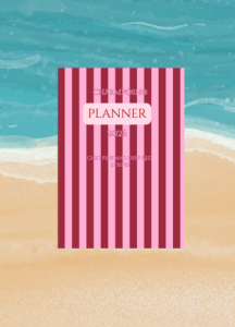
The CHARMPOSH® 2026 Planner in Chic Pink and Deep Red Stripes is a curated essential for those who view planning as a daily ritual of beauty. It transforms organization from a task into an intentional lifestyle choice.
– Sophisticated pink and deep red stripe aesthetic
– Refined design that complements a quiet luxury workspace
– High-quality finish for a tactile, indulgent experience
As an affiliate, I may earn a commission from qualifying purchases made through links in this post.
Frequently Asked Questions
How is a Focus Page different from regular goal setting?
Focus Pages emphasize gentle attention over achievement pressure. Instead of multiple goals to accomplish, you choose three areas to mindfully nurture throughout the month, creating a sustainable practice that honors both progress and self-care.
What supplies do I need for the blue floral aesthetic?
Start simple with blue-toned pens or markers in navy, cobalt, and powder blue. Add washi tape, watercolor pencils, or pressed flowers for texture. The key is choosing supplies that feel luxurious to use, not necessarily expensive.
Can I modify the Three-Area framework for my needs?
Absolutely! The framework is meant to simplify, not restrict. Some people prefer two areas for deeper focus, while others might add a fourth for seasonal intentions. Adapt it to support your lifestyle and aesthetic preferences.
How often should I update my Focus Page throughout May?
There’s no strict schedule. Many find weekly check-ins during ‘Focus Page Fridays’ create a lovely rhythm, but daily tiny additions or monthly reflections work too. Let your energy and inspiration guide the frequency.


Leave a Reply